HUSKYCARE
Mobile app Streamlining Students’ Access to On-Campus Healthcare
Roles: User Research, UX Design, UI Design
Time: September 2024 - March 2025
Team: Jessica Forcucci, Athena Ortega, Meredith Winiarski (me)
PROBLEM
As a team of current students tasked with “Designing for Balance,” we reflected on where we and our peers often struggled to maintain it. We recognized that, at times, we had all placed our health on the back burner in order to complete assignments, study for exams, or meet other academic demands. As students, our well-being was frequently deprioritized as we managed limited time and competing responsibilities. We also acknowledged the additional challenges of navigating the healthcare system in a new location, which further contributed to this imbalance.
How do we help students keep track of their appointments, vaccines, and prescriptions all in one place during the school year?
What is actually wrong with the system?
The healthcare space is crowded with digital platforms aimed at simplifying care management. To better understand where these solutions fall short, our team analyzed three existing healthcare apps and interviewed three UW students with diverse healthcare needs and experiences. Through this research, we identified key gaps in current platforms and uncovered additional pain points unique to the student healthcare experience.
TIME CONSTRAINTS
All three participants noted that time constraints limited their willingness to seek care. They expressed concern about the time spent scheduling, attending, and traveling to appointments, which competed with study time and left them feeling stressed and overwhelmed.
PROVIDER SPECIFIC RESOURCES
Existing apps focus on either specific providers or tasks in the healthcare space, but there is no all-in-one service to manage all medical needs in one place.
VACCINE SIDE EFFECTS
Getting vaccines presented an expected challenge for participants in terms of side effects. Our participants noted that feeling sick after getting a vaccine presents a particular challenge as it often prevents them from being able to go to class or get work done.
ON-CAMPUS HEALTHCARE
UW students have access to on-campus healthcare that is not open to the public (i.e, Husky Health); however, products like ZocDoc and Medisafe do not include the locations that are most convenient and potentially cost-effective to students
Hearing from real students about the challenges they faced with accessing healthcare during the school year allowed us to develop two personas to guide our design by focusing on users with distinct needs and goals.
UNDERSTANDING CONSTRAINTS
After speaking with real students who struggled to balance their healthcare needs alongside school, jobs, and extracurriculars, our team became deeply motivated to design a meaningful solution. However, we also had to stay realistic — we were working within the 20-week timeframe of an academic course while addressing challenges rooted in a trillion-dollar industry. Because of this, we chose to focus our ideation on specific pain points uncovered during research, rather than trying to solve every issue with one solution.
Brainstorming Notes
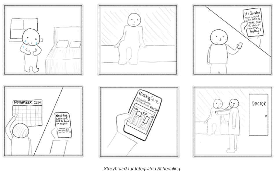
Solution 1: Integrated Scheduling
To reduce the mental load of appointment scheduling for students, we wanted to integrate students’ schedules with the available appointments at the Husky Health Center. This would allow students to quickly book appointments online by only recommending options that fit within their busy schedules.
Allow new patients to schedule first-time appointments online (without calling) at the Husky Health Center
Use information on vaccine side effects to schedule vaccine appointments that block out extra time for recovery
Use location information and travel information (by car, bus, etc.) to make transportation suggestions based on the user’s schedule
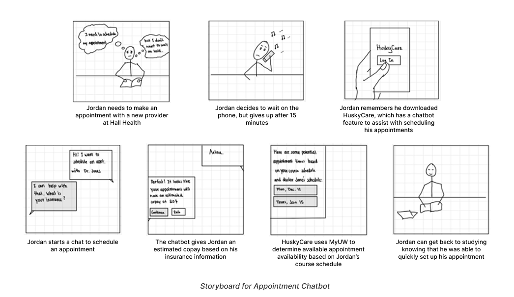
Solution 2: Appointment Chatbot
Hold times, confusion around insurance, and difficulties scheduling made it increasingly frustrating and time-consuming for students to prioritize their healthcare. This solution aims to eliminate these struggles by providing an interactive bot that can easily answer questions and schedule appointments at any time that is convenient for the patients. It additionally eliminates the need to wait to speak with a representative or call multiple providers.
Inform the user of the predicted insurance coverage for specific appointments before the user attends an appointment
Allow new patients to schedule first-time appointments online (without calling) at the Husky Health Center
Calculate the cost of a specific service with the user's insurance coverage
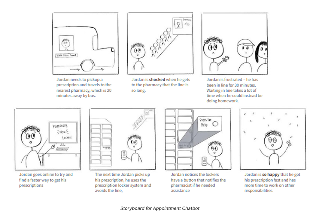
Solution #3: Prescription Lockers
Picking up prescriptions from a pharmacy often takes time, especially when one has to wait in line and consult the pharmacist before obtaining their prescription. Prescription lockers make this process easier by giving students the ability to pick up their prescription any time during the day (when Husky Health is open).
Allow users to pay for their prescriptions in the app before they arrive at the pharmacy/without having to be at the lockers
Notify the user via the pharmacy app when their prescription is filled and again when it is placed in a locker
Communicate to the user that lockers are full and they will have to wait in line to talk to a pharmacist
MOVING FORWARD
After our team consulted with experienced designers from the industry during a review session, we all agreed that creating a mobile interface with integrated scheduling, resources, and a feature to pick up prescription refills was the most promising idea.
Our rationale is based on:
The mobile app offered the most opportunities to help students feel more supported by providing resources for managing health, calling hotlines, and obtaining information about immunizations.
The mobile app emphasizes convenience. We want to empower students and help them feel more in control of their health. This solution enables students to not only schedule appointments with a provider using the integrated scheduling feature, but also to easily schedule prescription refills and pickups.
Lastly, the mobile app idea was the most comprehensive, allowing our team to incorporate various features into one solution: scheduling, prescription pick-up, and resources focused on health.
WHY AN APP?
While many people still prefer paper planners or scheduling, most medical scheduling and databases are digital. Additionally, many students’ schedules, including those provided by the University of Washington. During concept testing, we specifically asked users if they would prefer a website or an app. Our users overwhelmingly preferred an app as it increased feelings of privacy.
Prototyping a prototype
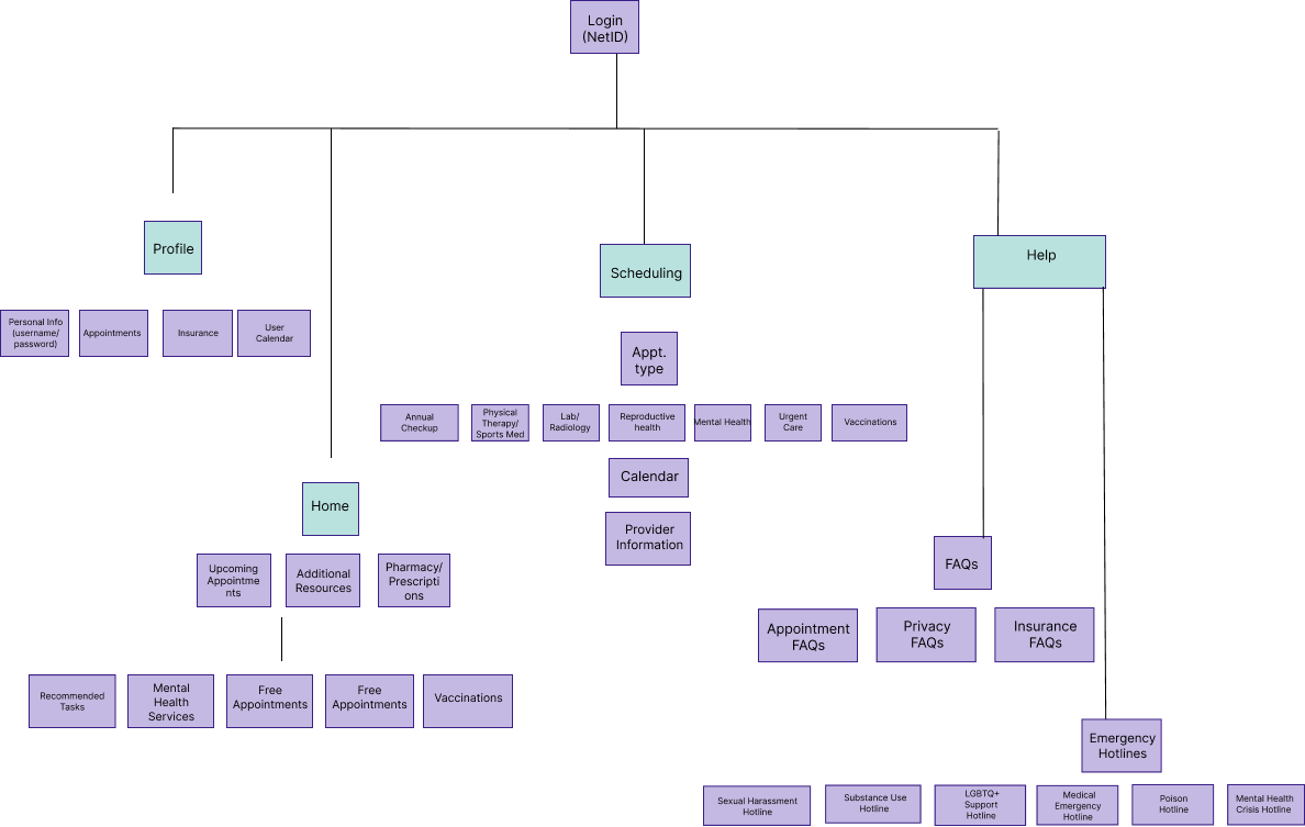
After finalizing our design direction, our team developed an information architecture (IA) diagram to define the overall structure of the HuskyCare interface. This diagram helped us organize and prioritize key features of the mobile app, grounded in insights from our storyboards, user flows, and research findings. Additionally, we conducted two rounds of usability testing to evaluate and refine the app’s architecture.
Using our information architecture as a foundation, we created a mid-fidelity interactive prototype for user testing. We conducted three usability tests to observe how participants interacted with the app and navigated key tasks. During the sessions, users were asked to think aloud while completing three in-app tasks, enabling us to understand their decision-making process in real time. We took detailed notes and recorded screen interactions to collect qualitative insights and measure task completion times. Afterward, participants responded to a mix of qualitative and quantitative questions to share feedback on their experience and highlight areas for improvement.
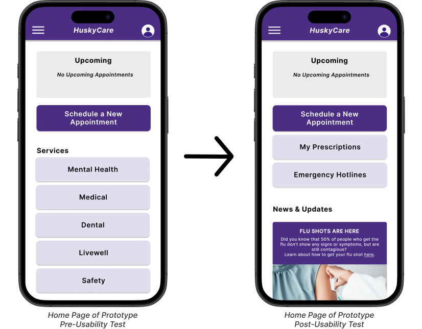
We took feedback from our users and directly addressed it within out final prototype. One of the largest complaints from our users during usability testing was that the categories underneath ‘Services’ were too vague. Additionally, users struggled during our second task with where to find the ‘Prescriptions’ section.
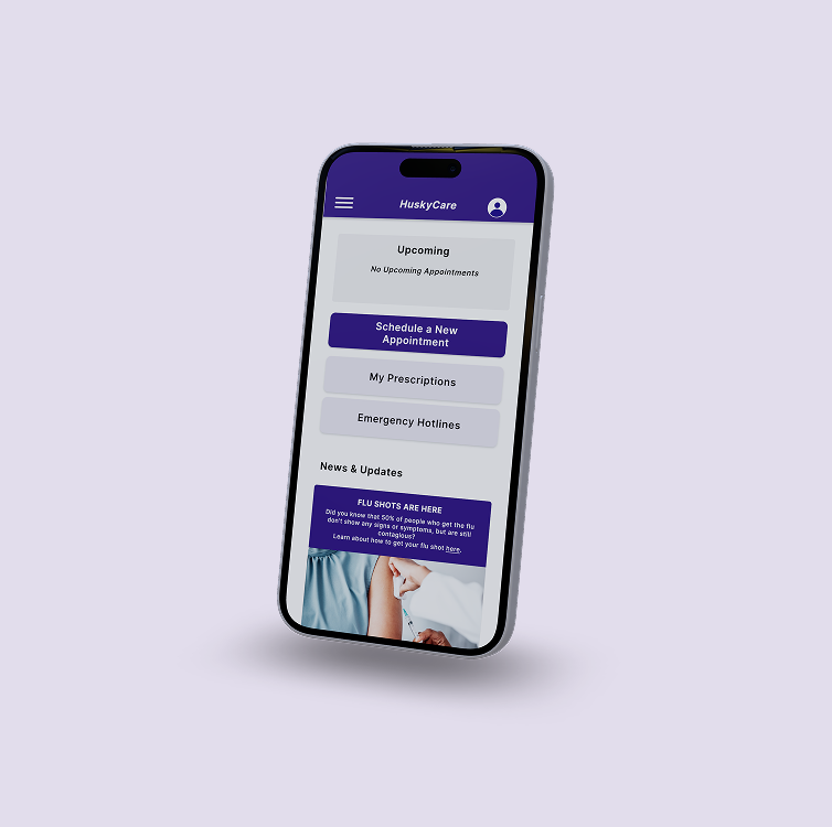
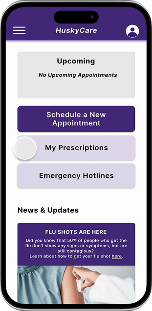
Using this feedback, we replaced the services section on the home screen with the Prescriptions Button and added an Emergency Hotlines button to the home page so that these resources would be easily accessible. Additionally, we included news and updates related to the Husky Health Center to inform students of potential closures, changes in hours of operations, or health reminders such as seasonal vaccinations.
THE FINAL DESIGN
KEY FEATURES
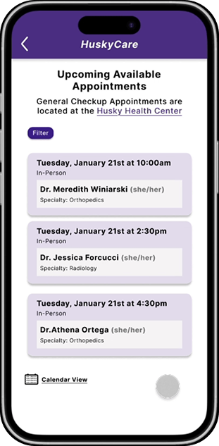
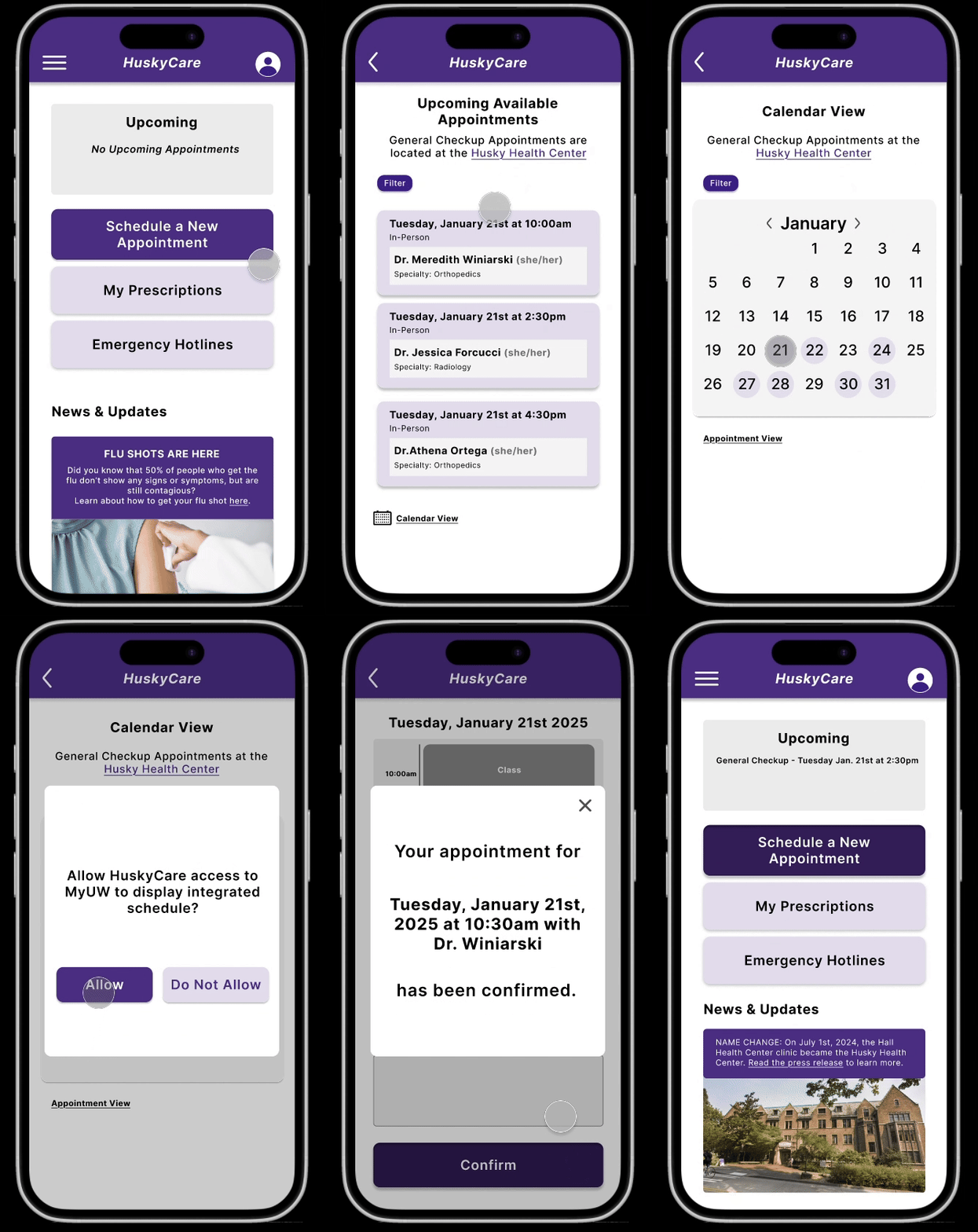
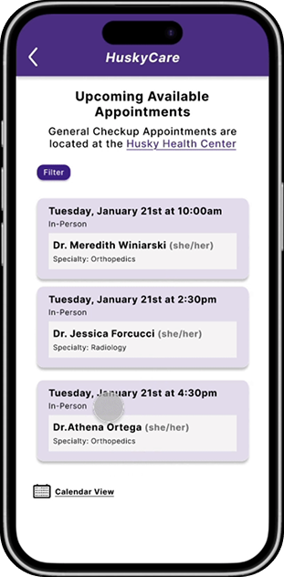
We implemented both a “List View’ and ‘Calendar View’ to provide users with two potential views.
The list view shows the next available appointments, which allows users to, while the calendar view allows users to easily book further in advance
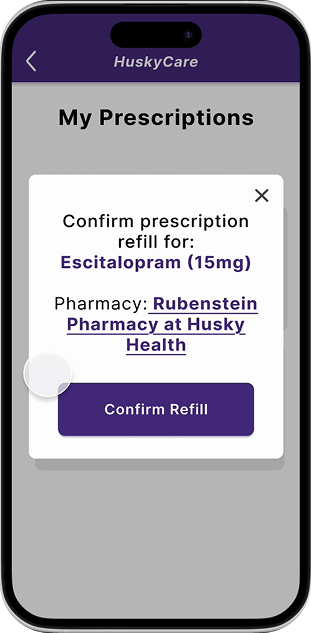
On the home screen, we added a feature to allow users to access information regarding their current prescriptions.
From there, the user can either request a refill for their prescription or schedule an appointment to meet with a pharmacist.
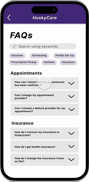
The “Frequently Asked Questions” page can be accessed by clicking on the hamburger menu.
The FAQs page is listed on this menu, along with other features that the user may need.
FINAL PROTOTYPE
When selecting appointments we added a visual schedule to show students exactly how the appointmentappointment they selected fits into their schedule.
After the user confirms their refill, they will be notified that their request has been placed.
We implemented a “status” feature on the home page, where the user can check the status of their requested prescription.
The FAQs page contains a filter feature, where the user can click on a keyword depending on their needs.
Each FAQ contains a dropdown, to access the relevant information and any necessary links.
LESSONS & REFLECTIONs
HuskyCare was a great opportunity for me to grow as a designer and resseracher and experience working on an end-to-end design project. Though each member of my etam had unique skillsets and interests within the scope of HCDE, we were able to effectively leverage them for this project and produce a final product we are all proud of.
What if i had more time?
Although we dedicated nearly an entire quarter each to research and design, our team still felt constrained by time during both phases. Designing for the healthcare space introduced additional complexity, given the wide range of stakeholders involved, including doctors, pharmacists, administrative staff, and insurance providers. In future iterations, I would aim to include these stakeholders more directly in the design process to better assess the feasibility and integration of our solution. Furthermore, deeper research into healthcare privacy regulations and insurance systems would be essential to ensure the app could securely and legally connect with students’ healthcare and insurance information. Conducting additional background research and stakeholder interviews would greatly enhance the app’s overall feasibility.
BIGGEST TAKEAWAY
LONG-TERM TEAMWORK
During user research, we uncovered several additional problems beyond our initial focus, revealing multiple potential directions for the project. While we wanted to address all of these challenges, doing so wasn’t realistic within our limited timeframe. Attempting to tackle every issue would have stretched our time and resources too thin to effectively solve any one problem. In the end, we prioritized the most significant challenges students faced and grounded our final design decisions in user research and feedback to ensure our solution would meaningfully benefit them.
Though I had worked on group projects before, this was my first experience collaborating with the same team on a project that spanned two quarters. This experience required me to be proactive about managing my schedule, balancing consistent communication with clear role assignments. Because our team’s schedules made it difficult to meet outside of class, we made sure to come to each session fully prepared so we could use our limited in-class time efficiently. While this was challenging, maintaining constant communication reinforced the importance of collaboration and brought fresh perspectives to every discussion.

